Finally I got the drawings sorted out ... kind of.
1) Camouflage 1:
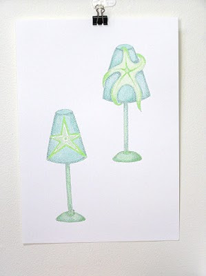
 "Camouflage 1", pen and paper, 30cm(H) x 21cm (W)
This was finished last Monday and as mentioned in my earlier post, the drawing doesn't feel right to me. It looks to me "static".
2) Camouflage 2:
 "Camouflage 2", ink and paper, 30cm (H) x 21cm (W)
By making the lampshade tilted to one side with the cheeky starfish hanging onto it, I think it shows the "camouflage" idea better and allows the fun / humor to come off stronger. The drawback of this one is that I'm not satisfied with the design of the starfish. I preferred the 1st one.
I can't really say the drawings are finished as I still have a nagging feelings towards them. There's something missing. Too much white space? The lamps need to sit on something, like a table top? (Boring!) Add shadow at the lamp base to make it looks real??! You can see I'm a bit lost.
Anyway, I've learn some valuable lessons from these two drawings.
- I can't produce the same drawing twice. Though the alteration is minimal, I was definitely in another mood and can't seem to copy from my previous work. Also spontaneity plays a big part in all the details in my drawing and it is something that cannot be repeated.
However, I do wonder if it is related to my lack of drawing skill, hence I can't "re-work" the same drawing? Would a trained / experienced artist be able to reproduce h/her work more easily? Any comments / insights would be most welcomed.
- I'm still having heaps of troubles in applying ink wash. Thanks to Rowena and Chapter Forty, I got useful tips of applying some water color painting techniques to my drawing. I'm yet to learn more about it.
Just like most thing in life, it all comes down to trail and error plus practice. Let's hope that improvement will begin to show over a period of time.
Enough of my babbling ... as usual, my fellow creatives and bloggers, what do you think of these two drawings? Which one you prefer? (Or none at all!)
Last but not least, The Monday Project girls are back online! Check out the new project. Do come and play along! :)
Don't mean to be absence from blogging for this long. It's just the hot weather down here is not conductive to creativity. (Might not be to you, definitely to me.) I'm feeling fuzzy and muggy all the time. :(
But don't think that I haven't been creating. I finished a drawing two nights ago. However, as soon as I laid down my brush, I knew something was off about it. Actually I think I knew it all the way, but I lack the experience (?) aptitude (?) to notice it without completion.
Last night I re-drafted part of it and I'm planning to finish the transfer by Fri so I could begin the actual drawing over the weekend. I'm trying to be cool (both in mental and physical sense, haha!), forgiving and accepting about the "late discovery". But can't help not to feel a bit frustrated. I'm also have a strong feeling that as I get into drawing more, this situation will happen more. Hmmm ... worry ... Worry ... WORRY ...
This prompt me to wonder if the same thing happens to other fellow creatives / artists / bloggers. I'd like to know how you deal with it.
On the similar topic, Keri Smith has created "The Artist Survival Kit". Check it out. Also read her blog entry on 05/02 about "How To Feel Miserable As An Artist". (Sorry, unable to get the link for you.)
That's all for now ... stay cool!
 1) "The Hoarder" (scan), ink on paper, 30cm (H) x 21cm (W)
 2) "The Hoarder" (photo, click to view detail), ink on paper, 30cm (H) x 21cm (W)
After much thoughts, I decided to post "The Hoarder".
Reason why I felt (still feel) reluctant was that I didn't feel comfortable about the yellow of the starfish. It wasn't what I wanted. But because of the "lightfast" quality of ink, I had a hard time to maintain one tone of yellow in one smooth application.
My original idea is to have a rather light yellow on the body of the starfish. But with such fast drying medium, I kept leaving streaks of light yellow color. Then I began to apply more yellow to cover up the "streaks" which lead to the present yellow.
The problem of color streak is less obvious if I'm using darker tone of a color. Anytime I dilute the ink to create a kind of watercolor effect or simply want a lighter shade of a color, the streaks show up. This is driving me nuts and I can't seem to avoid it. (BTW, my fellow creatives, do you know how I can avoid streaks while coloring?)
Anyway, by avoiding to look at the drawing for a couple of days then returned to look at it again, I found it less "disagreeable". I also reminded myself that I'm still learning my craft. It is o.k. to produce "not good enough" artwork. And that 368 (yes, I counted it!) light bulbs are a real labor of love. I owe it to myself to show this drawing!
As usual, I'd like to hear of your comments. Thanks!
NOTE:
- The use of yellow is to follow a prompt of a project which requires drawings to be done relying heavily on one color.
- 1st pix: This is the scanned version of the drawing which shows a more accurate color representation from the original.
- 2nd pix: This is taken by digital camera. The color is less vibrant (due to my lack of skill to take decent photos) but the details (i.e. shading) on the light bulbs are clearer.I'll need to find a better way(s)? to display my drawings ... hmmm ...


